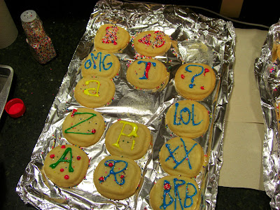


This is what dreams are made of.

 We chose to put our secret on the bus stop because of the frequent traffic at this particular bus stop. The bus stop is a very public place, people are constantly looking at the route map, so we figured it would be the perfect place for a secret. The readability is clear because of the contrast of the black letters and the light background of the map. The secret is at eye level and can be easily viewed by anyone sitting or walking by the bus stop.

 We chose the cross stop button because like the bus stop, it is a very public place. Anyone who needs to cross the street will push this button and hopefully they will see the secret. The readability of the metallic background and the black letters provides a good contrast that mirrors the other parts of the button. The user ability is affected because not everyone looks down at the button before pressing it.
 The side mirrors are usually private, used by the driver. We chose to place the secret on the side mirror because its guaranteed that the driver will look at the mirrors eventually and the purpose was to get it into the public, so a random driver will see it, making the secret public.


 The street sign is viewed by anyone who is trying to park so they know when is an acceptable time to park on the street. This makes the secret public, because many people will view and interact with this sign on a daily basis. The readability is clear up close because of the contrast between the orange in the sign and the black lettering, however, from a distance, it is difficult to see.


 I love goldfish crackers. They're so tasty and delightfully salty. When I was reading the back of the bag I suddenly got excited. I thought to myself "the pissed of fish in the story is named Gill and it looks almost like the typeface they used for some of the packaging is Gill Sans!" I wish I could say that this is Gill Sans, but the "l"s, the "y"s and the question mark "?" are definitely different.